
The #witchymodernhouse kitchen

After photo of the kitchen
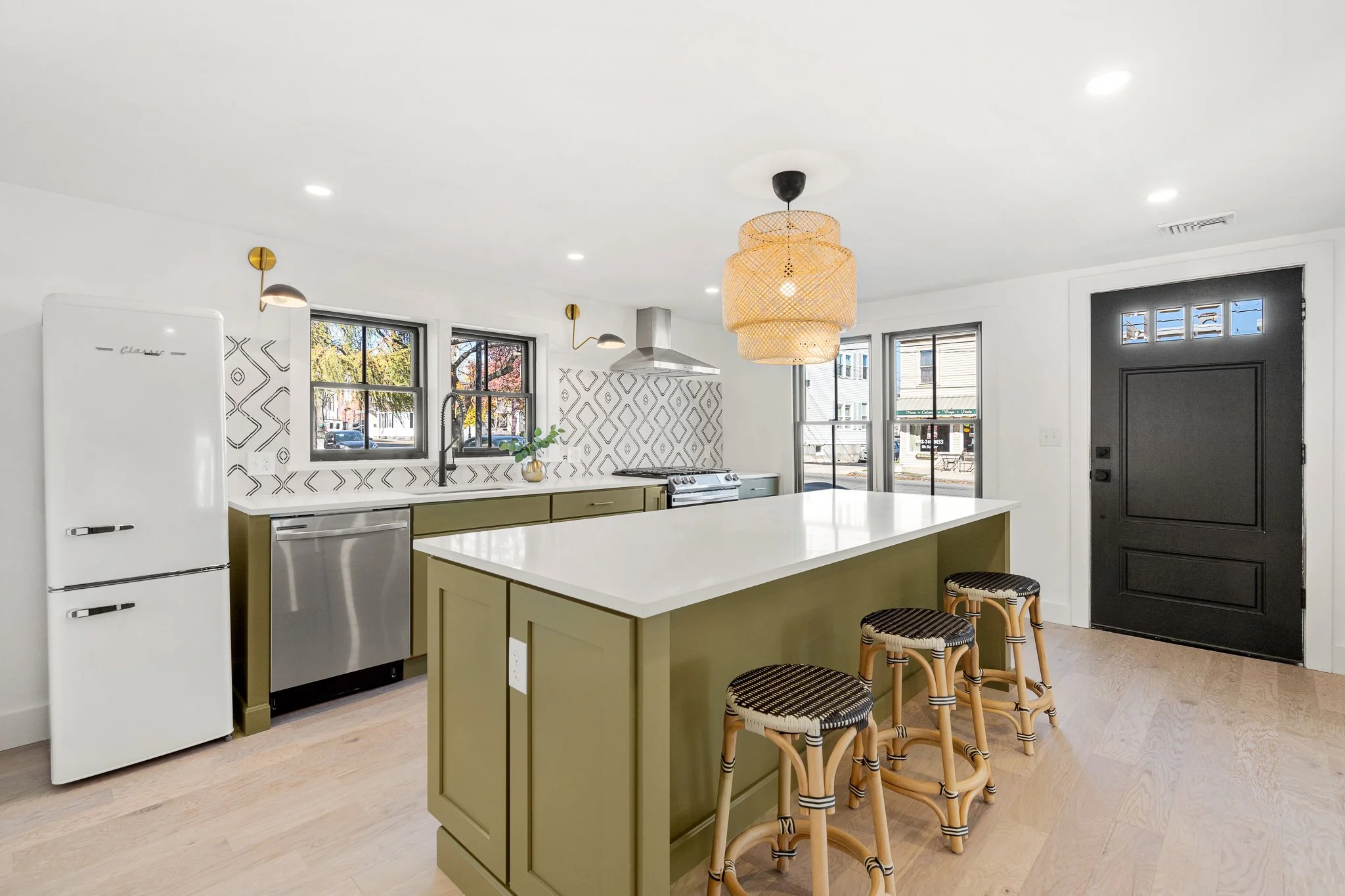
One of our favorite spaces we’ve ever designed happens to be the kitchen at the #witchymodernhouse! As you can see from the before photos, the space was pretty much a blank canvas and was in desperate need of brightening up.

Before photo of the kitchen

Before photo of the kitchen layout

Wall Paint / Cabinets / Pulls (similar style found here) / Wall Tile / Sconces / Range / Range Hood / Stools (similar style found here)
Because the ceilings were on the low side, we opted to forgo upper cabinets and went for a minimal, modern look. We love how the olive green cabinets add color and warmth to the space, but still feel neutral and timeless.
The other major design statement in this kitchen is the cement tile backsplash. The vertical diamond pattern has an elongating effect and adds movement to the space. Since the pattern itself is pretty busy, we stuck with a neutral black and white color scheme.

Pendant / Microwave / Microwave Trim Kit / Open Shelving
Initially, we were torn between black and white for the countertops. Black honed granite or soapstone would have looked beautiful with the green cabinets and given a little weight to the space, but in the end, we chose to keep things light and bright with white quartz countertops.

Pendant / Sconces / Pulls (similar style found here) / Faucet / Sink
For lighting, we used an IKEA favorite rattan chandelier over the island and mid-century inspired black and brass wall sconces. We continued to mix metals with the other finishes, opting for brass cabinet pulls and a black faucet. Mixing metals makes for a more complex layered design, even with such a small space!
Refrigerator / Dishwasher / Flooring / Stools (similar style found here)
Although this kitchen has a small footprint, it’s super functional and has tons of storage and workspace…and style!
Sources
Kitchen
Wall Paint: Benjamin Moore Chantilly Lace OC-65
Wall Tile: Arielle Black Cement Tile
Cabinets: Shaker Maple in Olive (discontinued)
Open Shelving: 36" Floating Wood Shelf in Natural - Threshold
Pulls: Miseno 5 Inch Center to Center Handle-Style Cabinet Pull in Champagne Bronze (discontinued) (similar style found here)
Faucet: Vigo Livingston 1.8 GPM Single Hole Pre-Rinse Pull Down Kitchen Faucet
Sink: Luxier BHS30-18Z 30" L x 18" W Undermount Kitchen Sink
Range: Samsung 6.3 cu. ft. Front Control Slide-In Electric Range
Range Hood: Winflo 30 Inch Convertible Stainless Steel Wall Mount Range Hood
Microwave: Samsung 1.9-cu ft 950-Watt Countertop Microwave (Stainless Steel)
Microwave Trim Kit: Anodized Brushed Aluminum Microwave Trim Kit
Refrigerator: Retro 21.6 in. 7 cu. ft. Bottom Freezer Refrigerator in Marshmallow White
Sconces: ED Ellen Degeneres Jane 1 Light Wall Sconce
Pendant: IKEA Sinnerlig Bamboo Pendant
Flooring: Mohawk City Vogue in Seattle Oak
Stools: Perry Rattan Backless Woven Counter Height Barstool in Black/White (similar style found here)
Get the Look

1 Cabinets / 2 Wall Tile / 3 Pulls (similar style found here) / 4 Stools (similar style found here) / 5 Refrigerator / 6 Pendant /
7 Faucet / 8 Sconces / 9 Sink / 10 Range Hood